the tuttle shuttle / aka the noyer
Here she is! Affectionately named the Tuttle Shuttle, but officially The Noyer by Minimaliste Tiny Houses. The house is 28 ft long (30 ft including the bump out over the hitch) and 10 ft wide. Below is a full photo gallery of my house, along with a few notes on how and why I designed each space the way I did. Enjoy!
Living area
The main goal with my living area was to make sure I had a comfortable space to relax. I have seen many tiny houses with very small sofas, or built in sofas that just don’t look like they’d be cozy at all. My living area is 7 ft long, plus 2 ft in the bump out. I opted for a very deep sofa that is the same size as a twin bed when the cushions are removed, so it can double as a guest sleeping area. My dog Skye sure loves it :)
The bump out was always reserved for my drum set, but luckily I was also able to fit a side table I bought during my trip to Quebec to visit Minimaliste! Underneath the TV is a small live edge walnut shelf to house my speakers and turntable. I sourced the wood from a woodworker in Toronto who was able to match it exactly to the color of my kitchen countertops. There are 2 coffee tables that store underneath the TV with flip cushion lids that also double (triple? quadruple?) as additional storage and extra seats.
The living area is raised for a few reasons. First being for the obvious storage benefits. Working as an outdoor lifestyle photographer, I have quite a bit of photo equipment and outdoor gear. I knew I needed a place to store all of it and drawers seemed like the perfect option. Each drawer is 7 ft long and 2 feet wide, giving me plenty of storage and easy access to these frequently used items.
In addition to this, raising the living area makes it a very distinct zone that is uniquely separate from the rest of the house. This helps to make the house feel larger, but also creates visual interest by “dividing” the house through different vertical spaces. As an added bonus, the 2 coffee table cubes are the perfect height to be moved to the edge of the platform and create an L shaped kitchen when I need the extra counter top space! I’ll be honest, when I was designing and I had this “multi functional coffee table” epiphany I was so stoked.
Kitchen
Designing the kitchen was super exciting for me. For some reason, pretty kitchens just make me happy. I knew from the beginning I wanted to go with a darker lower cabinet color to create a nice contrast. We went back and forth a bit on the exact shade of darkness, but settled on this lovely dark blue/grey that contrasts beautifully with the copper cabinet pulls I found on Etsy and the overall warmth throughout the house.
Finding the wood for the kitchen was something else that I really wanted to get right. I opted for walnut and made sure Minimaliste knew I wanted the middle/dark shade with the uneven grain tones and they totally nailed it. They used the same wood for the countertops, the open shelves, and my desk.
Between the two open shelves is a very special design that actually comes from my family home! Many years ago, I gifted my mom a tiny ceramic planter with this gorgeous blue design. I photographed the design, photoshopped it to the exact size and dimensions of the actual space, and sent the files to Minimaliste. Their partner, Muraluxe, was then able to print it on an aluminum panel. So yes, it’s not real tile! But every single person that comes in my house for the first time has no idea and thinks the tiling is real.
Also, I can’t explain how great it is to have a pull out spice rack. It’s just a few inches wide, but perfect to have right beside the stovetop for easy access to everything. Hiding underneath my stovetop is a Fisher and Paykel Dishdrawer that I absolutely love. Over on the other side to the right of my sink also hides away my Cuisinart Steam Oven behind a sturdy pull out drawer. I also have a microwave and a Berkey water filter that sits on top of my fridge. Oh and I also have hidden toe kick drawers. They are small, but perfect for cutting boards, cloth napkins, my Swiffer (seriously!), and some baking dishes.
Work Area
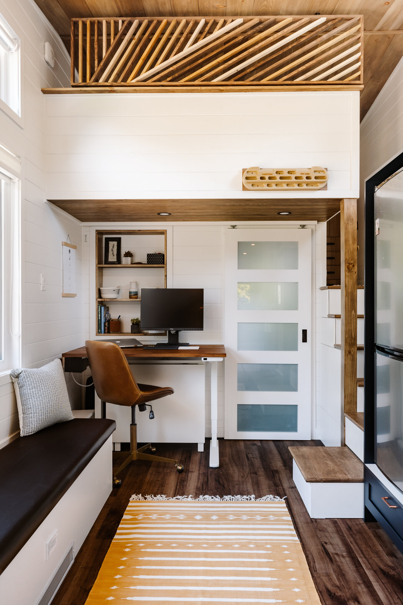
Because I work from home, having a dedicated work space was super important to me. It is away from my living area, making it easier to get in the zone and stay away from distractions. I use a sit/stand desk base from Uplift with a custom walnut table top along with my BenQ SW240 photo editing monitor. Minimaliste had the great idea to create a built in shelving unit right above my desk, and I love how it turned out! Underneath my desk is where I store my Ikea gateleg table. This thing expands to 5 ft - pretty crazy it can so neatly tuck away like that! When I’m entertaining guests, I pull it out in front of my long bench cushion and bring over my 2 coffee table chairs for additional seating if needed. Speaking of the bench, this thing also houses an incredible amount of storage. I keep a lot of my longer photography gear items in here as well as my tent, sleeping bag, and extra camping equipment.
The staircase beside the desk serves as great additional kitchen storage and a bit of quick access gear storage as well.
The overhanging loft also serves a couple different purposes. It allows me to have a larger loft while keeping the bathroom small, but also gives me free hanging space for my rock climbing hang board, as well as a place to hang my photo backdrops. Not seen in these photos, but I am able to mount a roll of seamless paper up on the face of the half wall, and pull it all the way down into the main room. This allows me to take portraits and product photos with a seamless color backdrop. I purposely put most of my windows on one side of the house, knowing it would be the north facing side, to have beautiful natural light for photos and also minimize the heat during the hot summers.
Bathroom
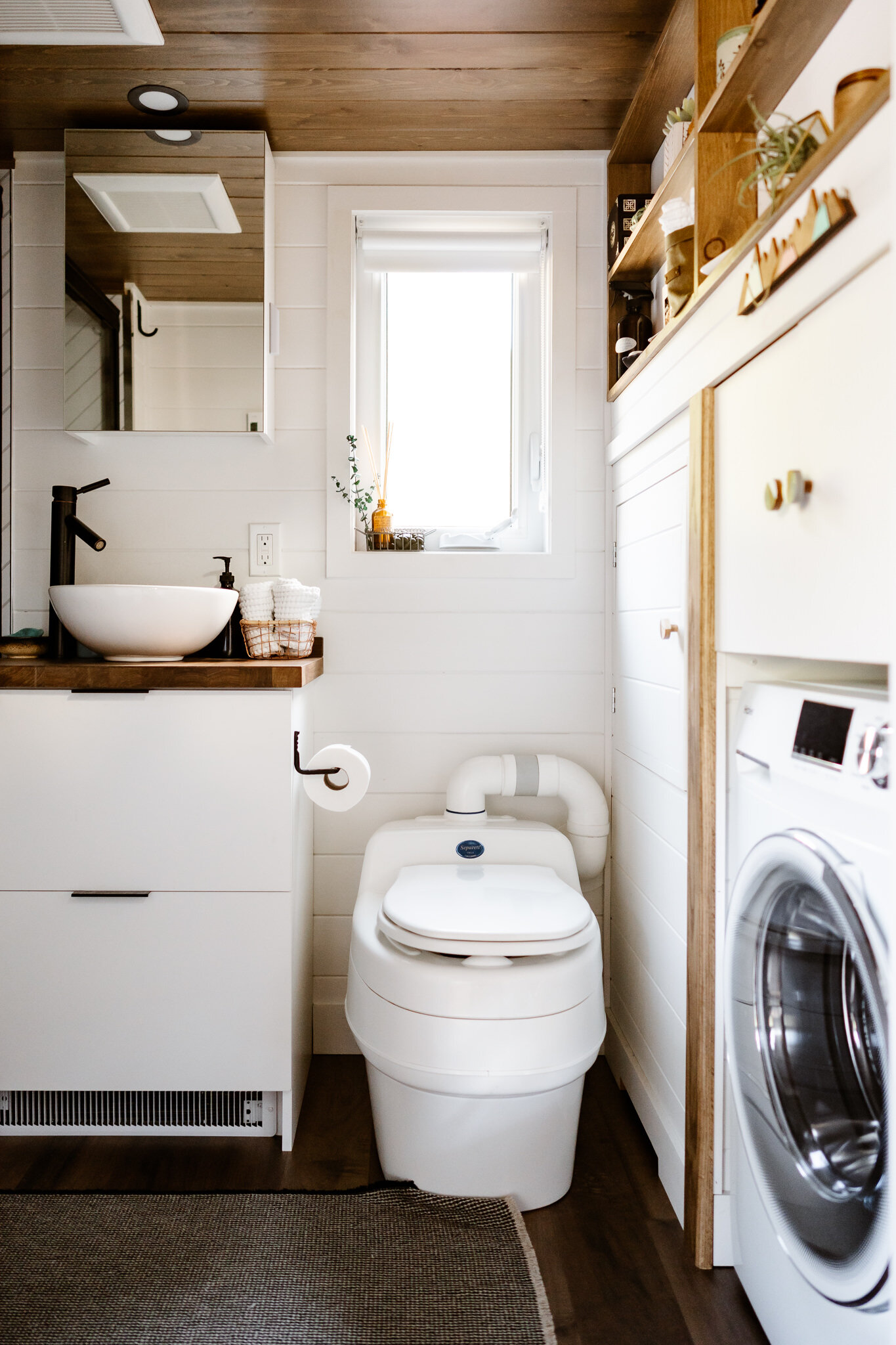
I would say the bathroom was at the bottom of my priority list when designing. I was totally fine with having a smaller bathroom in order to accommodate my desk on the other side of the wall. But of course, I still wanted it to be pretty :)
The bathroom is only 4 ft long, but it has everything I need and hasn’t once felt cramped. My shower in particular is very spacious at 32” x 48”. I have a Separett Villa composting toilet, which has been surprisingly easy to get used to - no complaints. Next to the toilet is my mechanical room for easy access, and next to that I have a combo washer/dryer from Haier. In the cabinet above, I store my extra linens and dirty laundry.
Check out my article on greywater safe products here.
Loft
My cozy loft! When I first started my design, I actually didn’t want a loft at all. I thought for sure I would get claustrophobic and tried to design around a downstairs bedroom. Although the more I refined my design, the more I realized that I was really wasting potential vertical space, so I decided to do a loft with a slight modification. Instead of having a staircase that leads all the way up to the height of the loft, it stops at a lower height to create a landing platform with a full length closet. In this way, I can stand comfortably beside my bed and access all of my clothes storage to change or fold laundry (I am 5’9” for reference). This was huge for me and really makes all the difference in making a loft feel like a bedroom. Because if you think about it, you never actually stand on top of your bed. Just beside it. And this is exactly what I’m doing with this setup. It also has the benefit of reducing the amount of space needed to have a staircase instead of a ladder. It really is a win win. For those of you with dogs, you know the necessity of having a staircase over a ladder for your pups who like to sleep in your bed, and I’m happy to report that my lab has no issues with the staircase whatsoever :)
I designed the roof slope to come to a peak right where I would sit up in bed. This, in addition to the half wall, really opens up the space and makes it feel incredibly spacious and not at ALL claustrophobic. Even so, I can still sit up fully even at the foot of my bed if I wanted to. I currently have a queen size mattress, but could fit a king size if need be.
And that’s it! Hope you’ve enjoyed this little photo tour. Be sure to check out Minimaliste’s video tour from the Quebec Expo Habitat back in January 2019.
Designing my house was such a dream come true and I’m forever grateful to Minimaliste for bringing it to life. If you are thinking about hiring Minimaliste as your builder, please feel free to reach out with any questions. Even if you are going with a different builder or are still in the deciding phases, home design is something I’m super passionate about and I would love to help you flesh out your own design in any way that I can!


